The 10 Golden Rules of Simple, Clean Design
There’s a lot more to simple design than you think. A product such as the iPhone may appear clean and unobtrusive to the naked eye, but there’s a lot going on beneath the surface that most people don’t know about. Nor do they need to. They only need to know that it will do what they need it to do, when they need it to do it.
That’s the underlying principle of Apple-style minimal design. Not necessarily to “strip” something down, but to make sure it’s easy to figure out and access with as few distractions as possible.
Here are what I like to call the “10 Golden Rules of Simple, Clean Design”. They are based loosely on the “10 Principles of Good Design” proposed by master product designer Dieter Rams, but I’ve modified them a bit to fit with a more general goal of design simplicity.
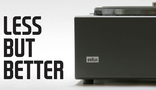
Less, but Better
Dieter Rams said it first, and it’s first on this list for a reason. Simple design isn’t just about subtracting things from a design willy-nilly. It has to improve the design’s overall effectiveness. Rams’ aim is to strip away the “non-essentials” of a design, to return it to a pure, simple state. However, too many designers seem to think that one has to keep stripping things away even past the point where it’s practical for the design.
To this designer, the goal isn’t complete and utter white space. If something is essential, but makes the design look clunky or inelegant, your job as a designer isn’t to eliminate it anyway, but to figure out how to “make it work.”
Be Neutral
This doesn’t mean your design has to be completely devoid of personality, but if accessibility is your goal, your design should provide an easy way for your viewer to make sense of the content. Remember, the number one goal of graphic and web design is to present content, to feed people the information they’re looking for in the least headache-producing way possible.
Be Honest
Your design needs to communicate the intent of your content clearly and honestly. If your viewer has the wrong idea of what your content is trying to tell them, your design isn’t honest enough.
No tricks are necessary here – everything about the design of your website, flyer, brochure, or poster, from the graphics down to the colors, should be suggestive of the product being sold or the information being conveyed.
Go For Timelessness
Of course it’s not for us to say, right now, what will become timeless and what will fade into obscurity. But there are certain rules you can follow to make sure your designs steer clear of fads and trends which will destroy their longevity. First of all, if something feels like a trend, it probably is. The thing that will help you most here is reading. I’m not talking about design blogs and websites either, though those are great resources for keeping up to speed with your fellow designers.
But certain design fundamentals are basic and important enough to be printed in a book and referred to over and over in your permanent library. The closer you stick to those fundamentals, the more classic your designs will be.
Don’t think that just because something is “classic” that it has to be boring, either. It’s true that certain approaches work better than others when creating designs that will speak to both present and future audiences, but keep in mind that classic work is being produced every day by creative professionals. It may be “contemporary” today, but give it a decade or two. It’ll be right alongside the greats in design libraries the world over.
Less “Design”
If you mention the word “design” in just the wrong context, some people will get a mental picture of something that’s fussy and overdone. That’s not what you want. Your job as a designer is to get out of the way of the content. Yes, design can be beautiful and an art form and all that warm, fuzzy stuff. However, the priority is always the content.
A helpful way to think of it is “assembly” versus “ornamentation.” Sushi, with its clear, separate components – each important to the whole in its own way – is a perfect example of an assembly type of design. The fish, rice, wasabi, Japanese mayonnaise (if you’re into that), and seaweed are like blocks of content in a design, which must be arranged to form a complete, concise, delicious bite.
There are endless ways a skilled sushi chef can assemble and arrange these blocks of content, and this same type of creativity can serve you as well in the creation of a clean design.
Ornamentation, on the other hand, is like the sprinkles on a cupcake. Or, to keep with the sushi theme (because I just love sushi), it’s the little bowl of soy sauce or the leaf used to hold the extra wasabi on the side. Nice to have, but essential? Unless you’re extra-hardcore about little wasabi leaves, I think not.
Be Thorough
Just because your design is simple, doesn’t mean you can get sloppy with the details. Remember that, in a minimal design, the end result your viewer will be seeing will highlight any and all flaws in your work. Quite mercilessly, I might add. When most of your design is white space, there are very few places to “hide” bad composition or an unfortunate typography choice.
Be Conservative
I don’t mean your design has to look like a frumpy, old librarian (apologies to any frumpy and/or old librarians out there), but it should be conservative in terms of the resources it uses. “Green” design is all the rage these days, but conserving your resources as a designer goes much deeper than that. It’s also about your personal resources – your time, your manual effort, your hard drive space.
A note I should make here is that, when you’re striving to create a simple, minimalist design, the majority of your resources should be spent in the beginning stages. Think of it like baking a cake, since my favorite kinds of analogies involve baked goods of some sort. When you lay out all the ingredients on your kitchen counter, it can be messy and confusing at first.
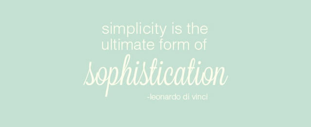
Then, once you slowly begin to combine things in the proper order, and the batter comes together in a single bowl that you can then transfer to the cake pan, you know that all that energy you spent in the preparation stages was worth it. You won’t see all that early work in the finished product, of course, but you’ll know it’s there.
Design is the same way. When you make your initial plans, sketches, and studies, you’re just like the baker in the kitchen, producing a clean, simple, singular design that reveals very little about the work that went into it.
Take Your Time
In order to give the details of your designs your full attention, you need to take your time and get them just right. This may seem like common sense, but I’m always surprised at the opinion many designers seem to have that simple design is somehow “easier,” or that it takes less time.
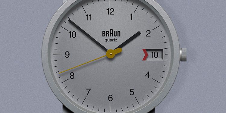
Minimalist design is like an optical illusion. The end result might look clean and simple, but that’s the point. It’s like ballet – the whole intent is to trick the viewer into thinking they’re seeing something easy and effortless. If you do, then the ruse was successful. But don’t think that it takes less time or effort to achieve those results. If anything it takes more time.
Be Understood
Good design doesn’t need to be explained. You know this, even if you’ve never consciously thought about it before. Think of all the items you use on a daily basis. Odds are good that you didn’t have to read a manual to learn how to use them. Your designs can be that straightforward as well. Note that I didn’t say they “will” be that straightforward – only that they “can” be.
It takes work to arrive at a place of such simplicity, but one way to approach it is to make a note of exactly what appeals to you about your favorite simple designs. Is it the ease of use? The approachability? The absence of clutter? Chances are good that straightforwardness has something to do with what makes these designs work.
Make It Pretty
Dieter Rams says that good design must be beautiful as well as useful. Why? Because “the aesthetic quality of a product is integral to its usefulness because products are used every day and have an effect on people and their well-being.” That means the more you look at something, the more of an impact it has on your senses.
If you’re looking at a hideous design day in and day out, you’re going to internalize some of that hideousness, and it’s going to affect your interaction with the world in some way. Maybe you’ll be a little more irritable to the barista at the coffee shop in the morning, or you’ll frown a little deeper and grip your steering wheel a little tighter when you’re stuck in traffic.
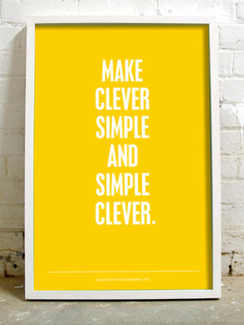
If you’re a designer, that ugliness might affect you in even worse ways (well, worse for designers at least). If all you’re looking at is bad design, your taste – or what Rams calls the “aesthetic” – will reflect that, and it will skew your perception of what “good” design looks like. After an onslaught of crappy designs, your own output will suffer, and pretty soon you might catch yourself actually contributing to the crap pile instead of fighting against it.
Don’t do this to your fellow designers. Take care with your aesthetics and inspire others to be and produce their best as well.
In Conclusion
Simple is a lifestyle. You have to think very hard about what you’re going to leave out of a design, and how you’re going to go about it. It’s not an easy process, but the more you continue to attempt it, the more you’ll discover what works and what doesn’t.
Author: Addison Duvall
Source: www.speckyboy.com